
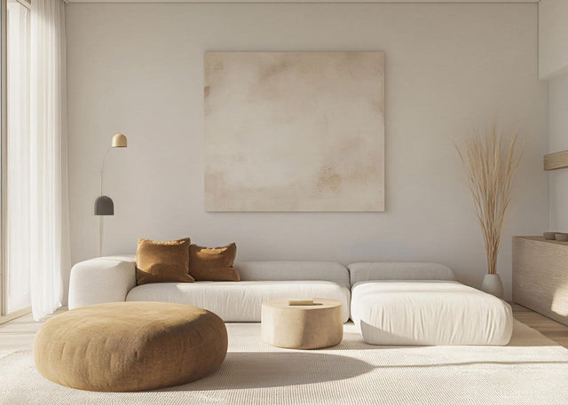
Living Room Wall Decor Ideas: A Designer's Guide to a Calm, Considered Space
A considered wall does more for a living room than almost any piece of furniture. The right living room wall decor ideas turn a flat, empty surface into the part of the room your eye settles on, the backdrop that frames your sofa, and the detail guests quietly notice. This guide gathers the approaches interior designers return to again and again, from oversized art and gallery walls to mirrors, shelving, panelling and statement timepieces such as our Modern Wall Clocks.
Walls are usually the largest uninterrupted space in a living room, yet they are the surface people leave bare for longest. That is partly because the choices feel endless and partly because scale, height and balance are easy to get wrong. So rather than hand you a list of fifty unconnected tricks, we have organised the most effective living room wall decor ideas into clear categories, each with the concrete measurements and styling logic you need to make confident decisions.
You will find guidance on planning a focal wall, choosing art and clocks at the correct size, building a gallery wall that feels curated, and layering texture, light and colour. These living room wall decoration ideas work in a space of any size, whether you want one decorative piece or a fuller scheme. Read it through, or jump to the section that matches the wall you are trying to solve.
Key takeaways
- Choose one focal wall before anything else, usually the wall behind the sofa, and let the rest of the room stay calm.
- Scale is the detail most people miss: art and clocks should span roughly two thirds of the furniture below them, with the centre at about 145 to 150 cm from the floor.
- A wall clock is the most overlooked of all living room wall decor ideas, because it is the only piece that is decorative and useful at once.
- Gallery walls work when you treat the whole arrangement as a single shape and keep spacing consistent.
- Mirrors add light and depth, shelving adds layered storage, and panelling, tapestries and lighting add the texture that flat walls lack.
- Combine two or three approaches per wall rather than chasing one idea, and leave breathing room around every piece.
On this page
- How to plan living room wall decor before you start
- Statement wall clocks: the overlooked idea
- Wall art and canvas prints
- Gallery walls that feel curated, not cluttered
- Mirrors to add light and depth
- Floating shelves and picture ledges
- Texture with panelling, tapestries and textiles
- Lighting as wall decor
- Accent paint and wallpaper as a backdrop
- Layering living room wall decor ideas by style
- A quick reference table
- Frequently asked questions

How do you plan living room wall decor before you start?
Good wall decor begins with a plan, not a purchase. The most successful living room wall decorating ideas all start the same way, with a decision about where the eye should land. Before you measure for a single frame, decide which wall will carry the most visual weight and commit to it. Everything else in the room should support that decision rather than compete with it.
Choose one focal wall
A focal wall is the single surface you want the eye to find first when someone enters the room. In most living rooms this is the wall behind the sofa, though a chimney breast or the wall facing the doorway can work just as well. Choosing one focal point creates balance and stops the room from feeling busy. The walls you do not highlight are not wasted; they give the eye somewhere to rest, which is what makes the focal wall feel intentional.
Get the scale and proportions right
Scale is the quiet reason some rooms look styled and others look guessed at. The guideline designers use most is the two thirds rule: a piece, or a grouped arrangement, should span roughly 66 to 75 per cent of the width of the furniture beneath it. Above a 220 cm sofa, that means art or a clock arrangement around 145 to 165 cm wide. Pieces smaller than this tend to float and look stranded, what stylists call the postage stamp effect.
Height matters just as much as width. Galleries and museums hang work so the centre sits at average eye level, about 145 to 150 cm from the floor, and the same standard suits a living room. When you hang above a sofa, leave roughly 15 to 25 cm between the top of the backrest and the bottom of the piece so it stays visually connected to the furniture.
Balance the visual weight
Once scale is settled, think about weight. A single large piece anchors a wall with calm authority, while a cluster of smaller objects needs careful spacing to avoid clutter. A reliable test costs nothing: cut paper to the size of each piece, tape it to the wall, and live with it for a day or two before you put a hole anywhere. This proportion logic borrows from the same principles as the golden ratio that has guided composition for centuries.

Statement wall clocks: the overlooked living room wall decor idea
A statement wall clock is the rare decor piece that is both sculptural and useful, which is exactly why it deserves a place near the top of any list of living room wall decor ideas. Most wall decor only asks to be looked at. A large, well chosen clock earns its place on the wall and quietly does a job at the same time, anchoring a room the way a single oversized artwork would.
The appeal of a fine wall clock is not in its mechanism, it is in its presence. A piece like our 90 cm living room wall clock, Estilo 90, holds a wall through stillness rather than noise: a clean face, generous proportions and an open, minimalist design that reads as calm rather than busy. Its lightness keeps it from feeling heavy on the wall, and a silent movement means it adds serenity to a room instead of an audible tick. That combination of quiet and scale is what turns a timepiece into a focal point.
Placement follows the same logic as art. Centre a large clock at about 145 to 150 cm from the floor, and when it hangs above a sofa, allow 20 to 30 cm of clear space above the backrest. Give a statement piece room to breathe, ideally 30 to 60 cm of uninterrupted wall around it, so its shape can register fully. Keep it away from radiators, fireplaces and long hours of direct sun, which can affect any finish over time.
If your wall calls for something more architectural, a clock can also sit within a gallery arrangement as the functional centre of a group of frames, or stand alone on a neutral wall as the single thing that completes the room. Lounge wall clocks work the same way, anchoring a relaxed sitting space with one quiet focal point. You can see the full range, sized for exactly this purpose, in our collection of wall clocks for living room spaces. Whichever route you take, a clock is the one idea on this page that you will use every single day.

Wall art and canvas prints
Wall art is the most familiar of all living room wall decor ideas, and for good reason: nothing sets the mood of a room faster. Of all the wall art ideas for a living room, the choice of size and subject does the most to set the tone. The question is rarely whether to hang art, but what to hang and at what size. Get those two answers right and almost any style works.
Oversized art for a single focal point
A single large piece is the most confident way to fill a focal wall. One generous canvas or framed print above the sofa creates an immediate centre of gravity and saves you the fiddly balancing act of arranging many small pieces. Abstract work in soft, tonal palettes suits a minimalist room, while a textured metal piece adds depth without colour. When in doubt about scale, size up; an oversized work reads as deliberate, where an undersized one reads as an afterthought.
How do you choose the right size of wall art?
Use the two thirds rule. Measure the sofa or console from edge to edge, then multiply by 0.66 to 0.75 to find your target width. A 200 cm sofa suits art around 130 to 150 cm wide, whether that is one piece or a grouping measured as a whole. Hang the bottom edge 15 to 20 cm above the furniture, with the centre near eye level. Remember that the frame counts: a wide mount and frame add visual width, so measure the whole footprint, not just the printed area.
Texture, metal and abstract pieces
Material changes everything. Canvas feels soft and contemporary, framed prints feel structured and classic, and metal wall art introduces a sculptural, three dimensional quality that catches the light as you move through the room. Mixing one textured piece with smoother surfaces elsewhere keeps a wall from feeling flat. Choose a palette that echoes something already in the room, a cushion, a rug, the timber of a side table, so the art feels woven into the scheme rather than dropped on top of it.

How do you create a gallery wall that feels curated, not cluttered?
A gallery wall feels curated when you treat the whole arrangement as one shape rather than a scatter of individual frames. Decide on the outer footprint first, then work inwards. The same two thirds guideline applies: the full group, measured from the outer edges, should span about two thirds of the furniture below.
Grid or salon style
There are two reliable formats. A grid uses matching frames in equal sizes for a calm, modern, ordered look. A salon style hang mixes sizes, orientations and mediums for a collected, characterful effect. Neither is better; choose the one that matches the mood of the room. A grid suits a minimalist living room, while a salon wall rewards a more eclectic, layered space.
Frames, spacing and cohesion
Consistency is what separates a gallery wall from a muddle. Keep the spacing between frames tight and even, around 5 to 8 cm, so the eye reads the group as a single unit rather than separate pieces drifting apart. Cohesion comes from a shared thread: the same frame colour, a consistent palette, or a single subject such as black and white photography. Lay the whole arrangement out on the floor first, or trace each frame onto paper and tape it up, before you commit to nails. A clock or a small mirror can join the group as a functional accent, treated as just another frame within the composition.

Mirrors to add light and depth
A mirror is one of the hardest working pieces of wall decor because it does two things at once: it decorates the wall and it makes the room feel larger. Hung opposite or beside a window, a mirror bounces daylight deeper into the space and lifts a room that feels dim. In a smaller living area, a well placed mirror can be the single most effective piece of wall decor you choose. That is why mirrors appear on almost every designer list of living room wall decor ideas.
Scale and placement follow familiar rules. A large statement mirror above the sofa or mantel works as a focal point in its own right, sized to roughly two thirds of the furniture below. A round mirror softens a room full of straight lines and introduces a different shape to the wall. For a more playful look, a cluster of small mirrors in mixed frames creates a reflective gallery wall that still feels light.
Think about what the mirror will reflect before you hang it. A mirror that catches a window, a piece of art, or a leafy plant gives you a second view of something pleasant. One that reflects a cluttered corner simply doubles the clutter, so aim the reflection with intention.

Floating shelves and picture ledges
Floating shelves turn a blank wall into a living, changeable display, which makes them one of the most flexible living room wall decor ideas you can choose. Unlike a fixed artwork, a shelf can be restyled in minutes with books, ceramics, a small framed print or a trailing plant. They earn their place in rooms that need both storage and personality.
A picture ledge is a shallower cousin of the floating shelf, designed to lean framed art rather than hang it. The advantage is freedom: you can swap pieces, layer one frame in front of another, and rotate your collection through the seasons without touching a hammer. The look is more relaxed and contemporary than a fixed gallery wall.
The single rule with shelving is restraint. The temptation is to fill every centimetre, but a styled shelf needs negative space to look considered. Group objects in odd numbers, vary their heights, and leave clear gaps so each piece can be seen. A few trailing plants soften the hard lines of books and ceramics and keep the display feeling alive. Stick to a calm, neutral palette across the objects so the shelf reads as one composition rather than a jumble. Shelves look especially composed when they flank a fireplace, a media unit or a window, framing the centre of the wall.

Texture with wall panelling, tapestries and textiles
Colour and art catch the eye, but texture is what makes a wall feel finished. Adding a tactile, three dimensional layer is one of the most underrated living room wall decor ideas, and it suits rooms where you want warmth without visual noise.
Architectural detail with panelling
Wall panelling adds instant architecture to a plain room. Vertical sections draw the eye upward, which makes a low ceiling feel taller, and the repetition of clean lines reads as elegant rather than fussy. Panelling also adds a subtle layer of acoustic softness, so a room feels calmer as well as more polished. Painted in a single tone with the wall behind it, panelling delivers depth through light and shadow alone, no pattern required.
Soft texture with tapestries and hangings
A wall hanging or tapestry warms up a large, empty wall in a way that hard, framed pieces cannot. Woven and fabric hangings absorb sound, soften acoustics and bring a handcrafted, tactile quality that feels human. They are particularly effective above a sofa or bed, where a single large hanging can fill a broad expanse without the cost or commitment of oversized art. Choose a palette and weave that echoes the textiles already in the room, the rug, the cushions, the curtains, so the hanging feels part of a whole.

Lighting as living room wall decor
Lighting is decor, not just utility. The right wall lighting shapes atmosphere after dark and draws attention to the pieces you have chosen, which is why it belongs on any thoughtful list of living room wall decor ideas. Treated well, light becomes part of the composition rather than an afterthought.
Wall sconces add a warm, layered glow at eye level, softening the flat overhead light that makes a room feel like an office. Placed in pairs, they bring symmetry to a sofa wall or a fireplace. A picture light mounted above a favourite artwork, mirror or clock gives it a quiet, gallery like spotlight and lends the whole wall a museum quality in the evening.
The trick is to layer. Combine a low ambient glow with one or two directed accents, and add a dimmer so the same wall can feel bright and social or low and restful depending on the hour. Lighting that you can adjust is lighting that works in every mood the room needs to carry.

Accent paint and wallpaper as a backdrop
Sometimes the most effective wall decor is the wall itself. A decorative living room wall does not always mean more objects on it; sometimes colour alone is the decoration. A backdrop of colour or pattern gives everything you hang afterwards somewhere to belong, and it is the fastest way to transform a room. Among all living room wall decor ideas, paint asks the least and changes the most.
A single accent wall in a deeper or warmer tone adds depth and contrast without overwhelming the space. Choose the wall that is least broken up by windows and doors so the colour reads as a clean field. Painting woodwork and skirting in the same tone, rather than a hard white, blurs the edges and makes the whole wall feel taller and more considered.
Wallpaper goes a step further, bringing pattern, texture or a mural to a single feature wall. Removable, peel and stick papers make this a low commitment choice, which suits anyone who likes to refresh a room often. Whichever you choose, let the backdrop set the mood and keep the pieces you layer on top in conversation with it, drawing on a coherent colour palette rather than competing shades.

Layering living room wall decor ideas by style
The strongest walls rarely rely on a single idea. They layer two or three, an accent wall behind a clock, floating shelves beside an oversized canvas, a picture light over a statement mirror, so the surface has depth and rhythm. How you layer depends on the style you are working towards, and these living room wall decor ideas adapt to all of them. The same wall decor for a living room reads differently whether you treat the space as a formal sitting room or a relaxed lounge.
For warm minimalism, the look Voglana is built around, restraint is the point. One large piece, generous negative space, a quiet palette and a single sculptural object such as a clock or a round mirror. The room feels calm because nothing shouts. For a classic scheme, lean on symmetry: paired sconces, a centred artwork, panelling and a balanced mantel. For an eclectic room, mix mediums freely, a salon gallery wall, woven hangings, mismatched frames, held together by a consistent colour thread.
Across every style, the same discipline applies. Anchor the wall with one hero piece, support it with one or two secondary layers, and protect the breathing room around them. Layering is addition with restraint, not accumulation.
A quick reference table for living room wall decor ideas
Use this table as a fast way to match an idea to your wall, with the scale and placement guidance designers rely on.
| Decor type | Best for | Scale and placement | Upkeep |
|---|---|---|---|
| Statement wall clock | A focal point that is also useful | Centre at 145 to 150 cm; 20 to 30 cm above a sofa | Low; keep from heat and direct sun |
| Oversized art | Calm, confident focal wall | Two thirds of furniture width; 15 to 20 cm above | Low; dust the frame |
| Gallery wall | Personality and collected character | Whole group spans two thirds; 5 to 8 cm gaps | Medium; restyle as you add pieces |
| Statement mirror | Light and a sense of space | Two thirds of furniture; reflect something pleasant | Low; occasional clean |
| Floating shelves | Storage plus changeable display | Flank a fireplace or window; leave negative space | Medium; restyle freely |
| Panelling | Architecture and quiet texture | Vertical lines to raise a low ceiling | Low; paint as needed |
| Wall lighting | Evening atmosphere and accent | Sconces at eye level; picture lights over art | Low; replace bulbs |
Putting these living room wall decor ideas together
Start with the wall, then the hero piece, then the layers. Choose your focal wall, anchor it with one statement, a clock, an oversized artwork or a large mirror, and build outward with shelving, lighting or texture only as far as the wall can carry without crowding. The best rooms are edited, not filled.
Bringing it into your own home
Every idea here rests on the same quiet discipline: choose one focal wall, get the scale right, and leave room to breathe. A statement clock brings that discipline together in a single piece, decorative, functional and calm, which is why it sits at the heart of the Voglana approach to wall decor. If you are starting with one considered piece, our living room collection is sized and styled with exactly these principles in mind.

A calmer, more considered wall
Decorating a living room wall is less about buying more and more about choosing well. The most effective living room wall decor ideas share a common thread: a single focal wall, pieces scaled to two thirds of the furniture below, a centre at eye level, and generous breathing room around everything you hang. Whether you reach for an oversized canvas, a curated gallery wall, a light catching mirror or a sculptural clock, the discipline is the same, and the result is a room that feels intentional rather than busy. When you are ready to anchor your wall with one piece that is both beautiful and useful, explore our wall clocks for living room spaces and start with the detail you will see every day.
Frequently asked questions
Where should you hang a wall clock in a living room?
Hang a wall clock on a clear, well seen wall, most often the wall above the sofa or above the mantel, where it can be read from the main seating area. The centre of the clock should sit at about 145 to 150 cm from the floor, the same eye level standard galleries use for art. When it hangs above a sofa, leave roughly 20 to 30 cm of clear space between the top of the backrest and the bottom of the clock so the two feel connected. Keep it away from radiators, fireplaces and long hours of direct sun, and avoid hanging it directly above a door. A simple paper cutout taped to the wall for a day is the easiest way to confirm the spot before you drill.
What size wall clock suits a living room?
The right size depends on the wall and the furniture beneath it. As a guide, a clock used as a focal point above a sofa should relate to the two thirds rule, spanning a meaningful share of the furniture width rather than floating as a small dot on a large wall. For a generous focal wall, a large clock around 90 cm in diameter, such as Estilo 90, reads as a confident statement and holds the space the way an oversized artwork would. In a smaller or busier room, a slimmer or more restrained design keeps the wall from feeling crowded. When you are unsure, size up rather than down: an oversized clock looks intentional, while an undersized one tends to look lost.
What are the rules for wall decor in a living room?
The core rules are simple. Choose one focal wall and let the others stay calm, so the room has balance rather than clutter. Scale every piece to the furniture below it, aiming for about two thirds of that width, and hang work at eye level, with the centre near 145 to 150 cm from the floor. Leave breathing room around each piece so its shape can register, and group objects in odd numbers when you cluster them. Tie everything together with a shared thread, a palette, a frame colour or a single material, so the wall reads as one considered scheme. Above all, edit: a wall with a little empty space almost always looks more polished than one filled to the edges.
How do you decorate a plain living room wall?
Start by deciding what role the wall should play. If it is your focal wall, anchor it with one strong piece, an oversized artwork, a large mirror or a statement clock, scaled to roughly two thirds of the furniture below. From there, add a second layer only if the wall can carry it: a pair of sconces, a floating shelf, or a band of accent colour behind the hero piece. A plain wall is an opportunity, not a problem, because it lets a single well chosen piece do the talking. Use the paper cutout trick to test placement, keep the centre at eye level, and resist the urge to fill every gap. Restraint is what turns a plain wall into a deliberate one.
Should every wall in a living room be decorated?
No. Decorating every wall usually makes a room feel busy and smaller, not richer. The more effective approach is to choose one or two walls as highlights, a focal wall behind the sofa and perhaps a secondary feature such as a gallery wall or a mirror, while keeping the remaining walls simple. Empty wall space is not wasted; it gives the eye somewhere to rest and makes the decorated walls feel intentional by contrast. Think of the bare walls as the quiet that lets the focal wall speak. This balance of full and empty is one of the most reliable principles in interior design, and it works in rooms of every size and style.
How do you choose the right size of wall art?
Measure the furniture the art will hang above, then multiply its width by roughly 0.66 to 0.75 to find your target. A 200 cm sofa suits art around 130 to 150 cm wide, whether that is a single piece or a group measured from edge to edge. Include the frame and mount in your measurement, since they add visual width. Hang the bottom edge about 15 to 20 cm above the furniture, with the centre near eye level at 145 to 150 cm from the floor. If you are torn between two sizes, choose the larger one: oversized art reads as confident, while undersized art looks like an afterthought stranded on the wall. For a grouping, treat the whole arrangement as one shape and apply the same two thirds guide.
How do you start decorating a living room wall?
Begin with a decision, not a purchase. Identify your focal wall, usually the one behind the sofa or facing the door, and commit to it. Next, settle on a hero piece for that wall and size it to about two thirds of the furniture below. Only then think about secondary layers, shelving, lighting, a touch of colour, and add them sparingly. Before any nails, cut paper to the size of each piece and tape it to the wall to test scale and height over a day or two. Working in this order, wall first, hero piece second, layers last, keeps the result balanced and stops the common mistake of buying pieces that never quite fit the space.
How do you decorate a large living room wall?
A large wall needs scale and a clear focal point, or it ends up looking sparse and disconnected. The most reliable solution is one oversized piece, a large canvas, a generous mirror or a 90 cm statement clock, sized to roughly two thirds of the furniture or wall span so it fills the space with authority. If a single piece feels stark, build a gallery wall and treat the whole group as one large shape, keeping spacing tight and even at around 5 to 8 cm. Layering also helps: pair a hero piece with floating shelves, a wall hanging or a band of accent colour to add depth. Whatever you choose, keep the centre of the arrangement near eye level and protect generous breathing room around the edges.
How do you build a gallery wall around a clock?
Treat the clock as the functional centre of the group and let the frames orbit it. Place the clock slightly off centre or at the heart of the arrangement, then balance it with framed art of varying sizes, keeping the spacing tight and consistent at about 5 to 8 cm so the group reads as one unit. Balance visual weight rather than size alone: a large clock pairs well with several smaller frames, while a medium clock can sit among similarly scaled pieces. Keep a shared thread running through the group, a frame colour, a palette or a material, so the clock feels integrated rather than added on. Lay the whole composition out on the floor first, then transfer it to the wall using paper templates.
What types of wall art work best in a living room?
The best choice depends on the mood you want. Canvas prints feel soft and contemporary and suit relaxed, modern rooms. Framed prints feel structured and classic, and pair naturally with symmetrical, traditional schemes. Metal wall art adds a sculptural, three dimensional quality that catches the light and works well where you want texture without extra colour. Abstract pieces in tonal palettes suit a minimalist room because they add interest without busyness, while a single oversized work makes the most confident focal point. Whichever type you choose, scale it to two thirds of the furniture below and echo a colour already in the room, a cushion, a rug or a timber tone, so the art feels part of the scheme rather than placed on top of it.
How do you choose a tapestry for a living room wall?
Choose a tapestry by matching its scale and palette to the wall and the room. A wall hanging works best on a large, empty expanse, often above a sofa, where its soft texture fills space that framed art would struggle to cover. Size it generously, aiming for roughly two thirds of the wall or furniture width, so it anchors the area rather than floating. For colour and weave, take your cue from the textiles already in the room, the rug, cushions and curtains, so the hanging feels woven into the scheme. Beyond looks, a tapestry adds a practical benefit: woven fabric absorbs sound and softens the acoustics of a room, bringing warmth as well as a handcrafted, tactile quality that hard surfaces cannot.